Dragonfly Studios
Dragonfly Studios
Dragonfly Studios
Film Graphic Design
Film Graphic Design

Designing Logos, props and title cards for "Funnyman", a horror comedy short film produced by Dragonfly Studios, a production company based in Texas.
Designing Logos, props and title cards for "Funnyman", a horror comedy short film produced by Dragonfly Studios, a production company based in Texas.
About Project
Aug. 2024 - Dec. 2025
Chuckle's Comedy Club Logo
Chuckle's Comedy Club Logo
Chuckle's Comedy Club Logo
Chuckle's Comedy Club Logo
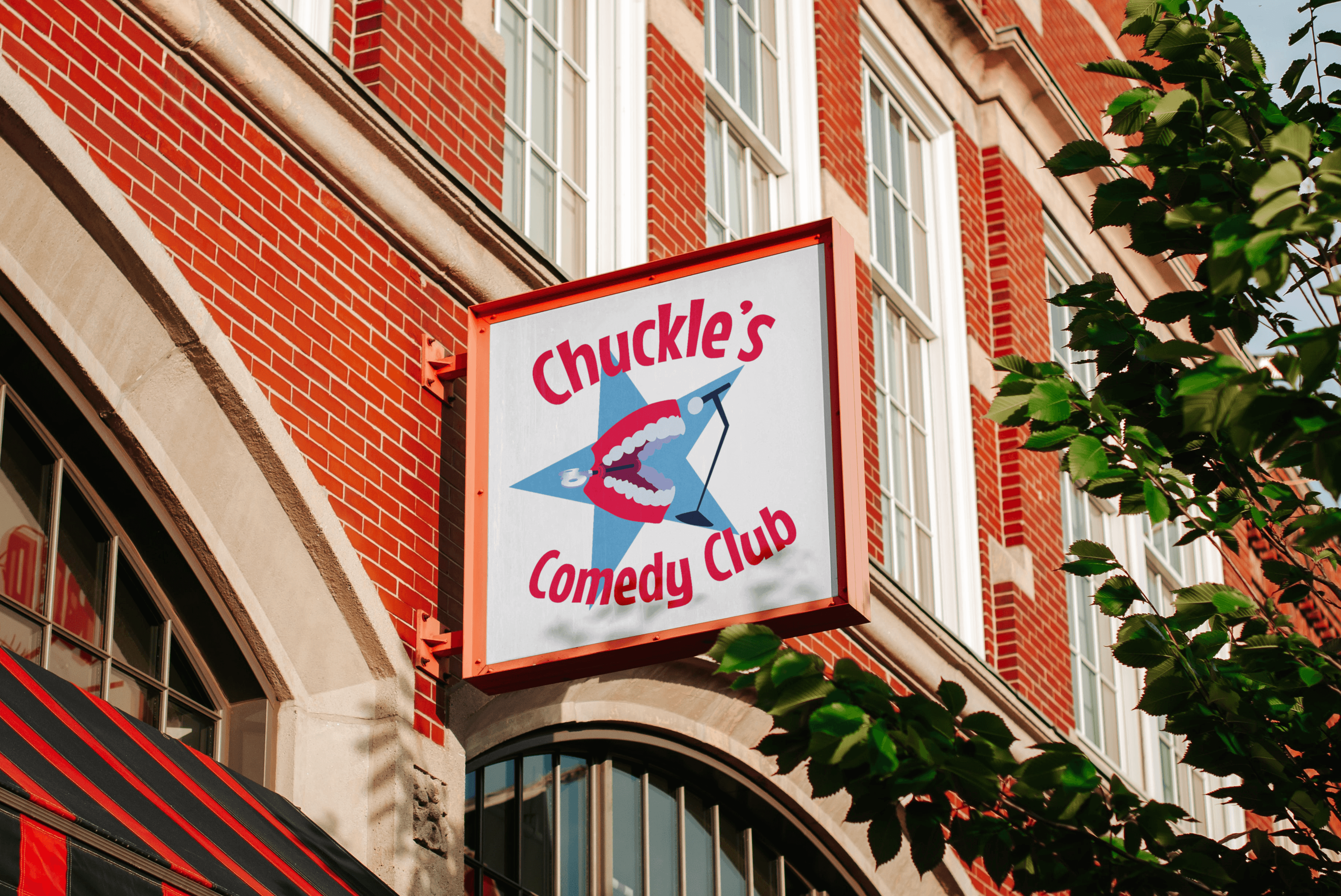
The film is a horror comedy that takes place in a comedy club, and my first project was to design a logo for the comedy club that the film was to take place in. They wanted something that was evocative of a mid-rate comedy club, so I designed these logos, using iconography like microphones, wind up teeth and a cartoonish font. I think the logo works well to communicate the setting and tone of the film, but I also think looks pretty great on it’s own merit, I could see this at a real club.
The film is a horror comedy that takes place in a comedy club, and my first project was to design a logo for the comedy club that the film was to take place in. They wanted something that was evocative of a mid-rate comedy club, so I designed these logos, using iconography like microphones, wind up teeth and a cartoonish font. I think the logo works well to communicate the setting and tone of the film, but I also think looks pretty great on it’s own merit, I could see this at a real club.
Mic Wire Variant
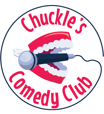
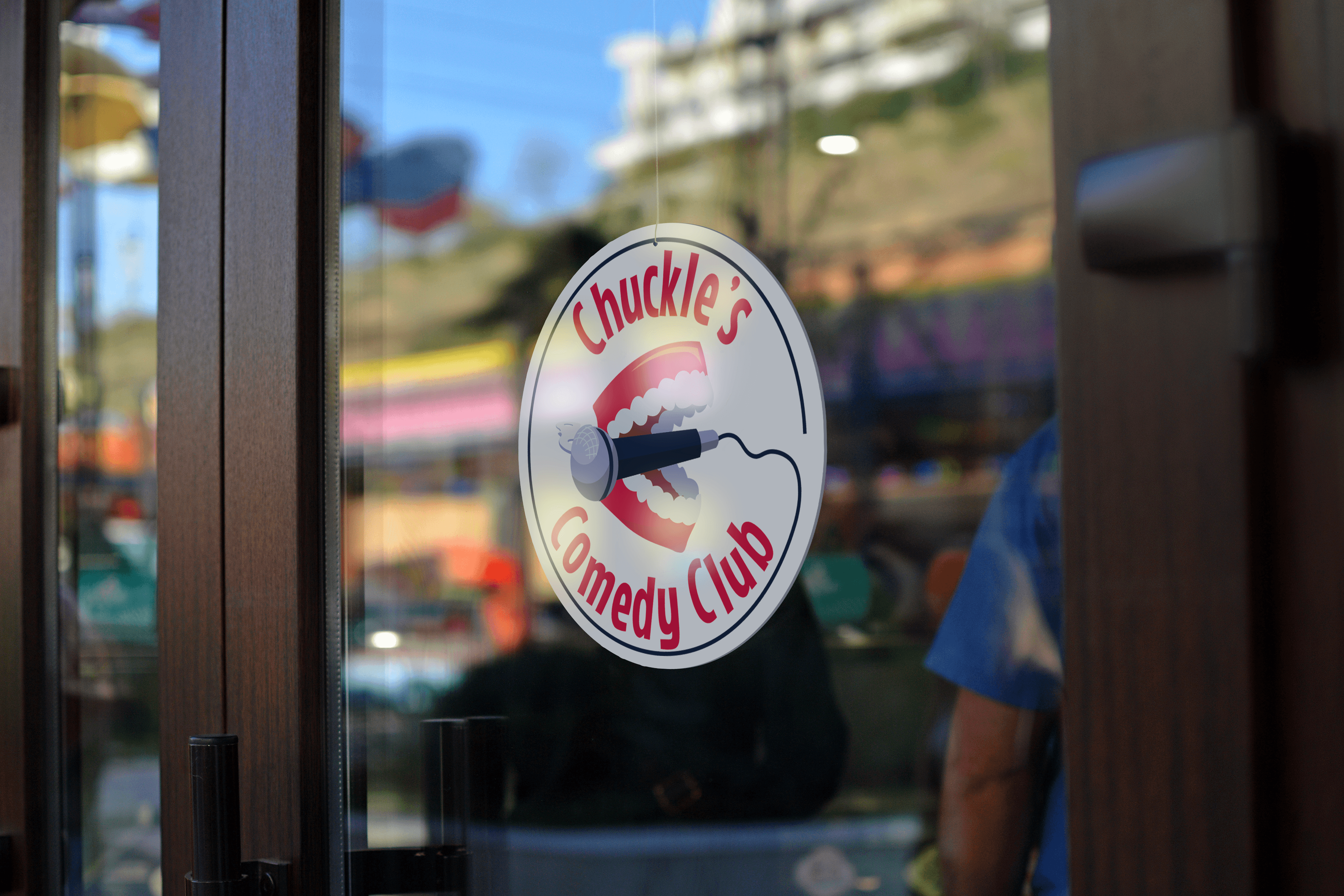

The film is a horror comedy that takes place in a comedy club, and my first project was to design a logo for the comedy club that the film was to take place in. They wanted something that was evocative of a mid-rate comedy club, so I designed these logos, using iconography like microphones, wind up teeth and this specific goofy looking text. I think the logo works well to communicate the setting of the film, but I also think looks pretty great on it’s own merit, I could see this at a real club.
Mic Wire Variant
Mic Wire Variant


Horizontal Star Variant
Horizontal Star Variant
Star Variant
Star Variant


Pinch Me! Buttons
Pinch Me! Buttons


After I designed the Comedy Club logo, they had me design some props like this “Pinch me!” Button that the film’s main character was supposed to wear in a dream sequence.
After I designed the Comedy Club logo, they had me design some props like this “Pinch me!” Button that the film’s main character was supposed to wear in a dream sequence.
After I designed the Comedy Club logo, they had me design some props like this “Pinch me!” Button that the film’s main character was supposed to wear in a dream sequence.
"Caca Light" Beer Cans and Bottles
"Caca Light" Beer Cans and Bottles


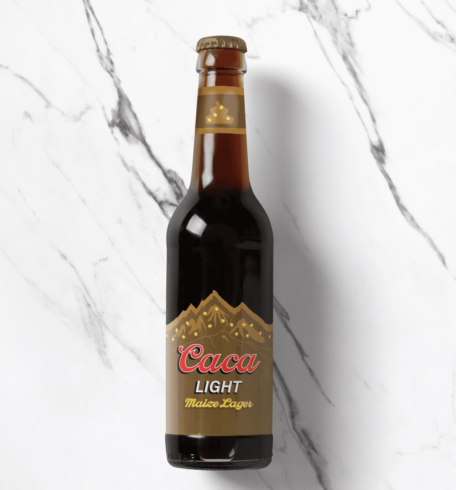

I designed labels for cans and bottles of “Caca light” which is a visual gag and clear parody of Coor’s Light.
I designed labels for cans and bottles of “Caca light” which is a visual gag and clear parody of Coor’s Light.

New and Improved Dragonfly Studios Logo
Later on I was asked to redesign the Dragonfly Studios production logo, which depicted a dragonfly flying in front of a film projector. The logo was a bit amateur, hard to read. The release of Funnyman would mark a milestone of professional quality that the production studio had only recently achieved, so the studio heads wanted a logo that was a bit sleeker that carried the same ominous energy as the 1970's Warner Communications logo. I made a logo that carried that ominous, minimal feel and communicated the same idea as the original logo (dragonfly in front of a projector) while uniting the text and imagery.


New and Improved Dragonfly Studios Logo

Later on I was asked to redesign the Dragonfly Studios production logo, which depicted a dragonfly flying in front of a film projector. The logo was a bit amateur, hard to read. The release of Funnyman would mark a milestone of professional quality that the production studio had only recently achieved, so the studio heads wanted a logo that was a bit sleeker that carried the same ominous energy as the 1970's Warner Communications logo. I made a logo that carried that ominous, minimal feel and communicated the same idea as the original logo (dragonfly in front of a projector) while uniting the text and imagery.
*Original Logo*
*Original Logo*

